
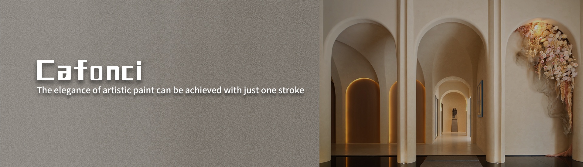
.jpg)
Walk into a space designed by a top interior designer, and you’ll notice something intangible—an atmosphere that wraps around you like a story. More often than not, that “something” is art paint. While most homeowners see paint as a “decor step,” elite designers treat it as a *transformative tool*—one that does far more than cover walls. Here’s the secret they keep quiet: art paint isn’t just about color. It’s about texture, emotion, interaction, and even sustainability—elements that turn a room from “nice” to “unforgettable.
Texture as Storytelling
Flat paint is a blank page; art paint is a novel. Top designers use texture to weave narratives into walls. Take micro-cement-inspired art paint: a matte, slightly rough finish in a bedroom can evoke the warmth of a European cottage, while a glossy, veined texture in a home office mimics the energy of a city skyline. Unlike standard paint, art paint’s tactile quality gives walls “depth”—not just visually, but emotionally. A client who loves travel? A designer might use a sandstone-like art paint in the entryway, its gritty surface reminding them of their favorite beach trip. It’s not just a wall; it’s a memory made tangible.
Color That Speaks to the Senses
Trendy colors fade, but *emotional color* lasts. Top designers don’t pick art paint based on “what’s hot”—they pick it based on how you want to feel. A restaurant designer might use a deep burgundy art paint with a velvet finish in the dining area: its soft sheen catches candlelight, making conversations feel intimate. A home gym? A bright citrus-y art paint with a matte, non-reflective finish—its flatness keeps the space energizing without overwhelming. The magic lies in *color layering*: a base of soft blue, layered with a translucent green using a dry brush, creates a “living” hue that shifts with light. Art paint isn’t just pigment; it’s a mood regulator.
Interaction Beyond the Wall
Flat paint is passive; art paint is active. It invites touch, movement, and connection. A metallic art paint with a hammered finish in a hallway catches light as you walk by, turning a passageway into a “moment.” A chalkboard-style art paint in a kitchen lets families leave notes or draw—turning a functional space into a communal one. Even a suede-like art paint in a reading nook: its soft texture encourages you to lean against the wall, making the space feel “inviting.” For designers, this is key: art paint engages multiple senses, turning a room from a “place” into an “experience.”
Sustainability That Doesn’t Compromise Style
Here’s the quiet win: top designers choose art paint for its *longevity*. Unlike standard paint (which fades or chips in 3–5 years), high-quality art paint (often with natural binders like lime or clay) develops a patina over time—getting more beautiful as it ages. A lime-wash art paint in a living room is breathable, mold-resistant, and ages into a soft, worn finish that feels like a family treasure. Even better? Many art paints are low-VOC or zero-VOC, safer for kids and pets. And because it’s durable, it reduces repainting—saving money and waste. For designers, this is style with purpose: a space that looks good *and* does good.
The Final Secret
The next time you’re picking paint, ask: Do I want to *cover* a wall, or *transform* a space? Art paint isn’t a luxury—it’s a choice to make your home feel like *you*. Top designers know this: the best spaces aren’t just designed. They’re *told*—one textured, colorful, emotional brushstroke at a time. The wall isn’t the canvas; the *space* is. And art paint? It’s the pen that writes the story.